Blog

7 Smart Ways to Boost Conversions with Notification Boxes on WordPress
Here are seven strategies for enhancing conversion rates on WordPress websites using notification boxes.
Notification boxes, often referred to as pop-ups or banners, are unobtrusive elements displayed on a website to capture visitor attention. They serve as a direct line of communication, allowing website administrators to convey specific messages, offers, or calls to action. The primary objective of utilizing notification boxes is to influence user behavior in a desired direction, most commonly leading to a conversion. This conversion can take various forms, such as signing up for a newsletter, downloading a resource, making a purchase, or subscribing to a service.
The effectiveness of a notification box lies in its ability to appear at a strategic moment during a visitor’s journey. It’s not about overwhelming the user, but rather about providing relevant information at a time when they are most receptive. Think of it like a helpful signpost appearing just as a traveler approaches a crucial intersection; it guides them towards their destination without being an impediment.
WordPress, as a widely adopted content management system, offers a multitude of plugins and built-in functionalities that facilitate the creation and deployment of these notification boxes. These tools provide various customization options, enabling website owners to tailor the appearance, timing, and targeting of their notifications to align with their specific marketing objectives.
The Psychology Behind Effective Notifications
The successful deployment of notification boxes hinges on an understanding of user psychology. Humans are naturally drawn to novelty and immediate rewards. A well-crafted notification box can tap into these impulses by offering a sense of urgency, exclusivity, or a tangible benefit. The principle of reciprocity is also at play; by offering something of value, such as a discount or free content, website owners can encourage users to reciprocate with their information or action.
Furthermore, the concept of scarcity can be a powerful motivator. Notifications that highlight limited-time offers or dwindling stock can create a sense of urgency, prompting immediate action. Conversely, fear of missing out (FOMO) can also be leveraged, although this should be done with caution to avoid alienating visitors. The strategic placement and design of notification boxes play a crucial role in this psychological interplay. A notification that is intrusive or irrelevant is likely to be dismissed, while one that is timely and offers a clear benefit can significantly increase engagement.
Types of Conversions Achievable with Notification Boxes
The definition of “conversion” is broad and context-dependent. For e-commerce sites, it typically means a sale. For content-focused websites, it might be an email signup or a download. For SaaS platforms, it could be a demo request or a free trial signup. Notification boxes can be employed to drive a variety of these conversions through targeted messaging and offers.
- Lead Generation: Capturing email addresses for future marketing efforts. This could involve offering a lead magnet, such as an e-book or checklist, in exchange for an email subscription.
- Sales and Promotions: Announcing special offers, discounts, or flash sales to encourage immediate purchases.
- Content Promotion: Highlighting new blog posts, guides, or webinars to increase readership and engagement.
- Event Awareness: Informing visitors about upcoming webinars, workshops, or live events they might be interested in attending.
- User Engagement: Encouraging users to follow social media channels, leave comments, or participate in surveys.
The key is to align the notification’s offer with the user’s current stage in their customer journey and their likely intent on the website.
If you’re looking to enhance your website’s performance even further, you might find the article on the upcoming features in Notification Box particularly interesting. This piece discusses the exciting updates in version 1.3, which can complement the strategies outlined in “7 Smart Ways to Use Notification Box to Skyrocket Conversions on Your WordPress Site.” To learn more about these enhancements and how they can benefit your site, check out the article here.
Strategically Timing Your Notifications
The timing of a notification box’s appearance is as critical as its content and design. Displaying a notification at random can be disruptive and lead to user frustration. Instead, notifications should be triggered by specific user actions or their duration on the site, ensuring they are relevant and less intrusive.
Exit-Intent Pop-ups: The Last Chance Saloon
One of the most powerful timing strategies is the “exit-intent” pop-up. This type of notification appears when a user’s cursor moves towards the browser’s close button, indicating an intention to leave the site. It acts as a final opportunity to engage the visitor and persuade them to stay or complete an action.
The rationale behind exit-intent pop-ups is that if a user is about to leave, they have likely consumed some content or browsed certain pages. This suggests a level of interest, and the pop-up can serve as a final attempt to address any potential hesitations or offer a compelling reason to reconsider. For instance, an e-commerce site might offer a discount code to a user abandoning their cart, or a content site might offer a related article the user might have missed. The effectiveness of exit-intent pop-ups often lies in their ability to seize a moment of potential loss and turn it into an opportunity.
Time-Based Triggers: Rewarding Patience
Notifications can also be programmed to appear after a visitor has spent a certain amount of time on a specific page or the website as a whole. This strategy acknowledges that users who invest time on your site are likely engaged and may be receptive to further interaction.
Consider a user who has spent several minutes reading a detailed article. A time-based notification might then appear, offering a related downloadable guide or an invitation to subscribe to a newsletter for more in-depth content. This approach respects the user’s browsing experience by allowing them to consume information first before presenting an offer. It’s akin to offering a helpful pamphlet to someone who has finished reading a lengthy book on a particular subject. The user has already demonstrated interest, and the notification offers an extension of that interest.
Scroll-Based Triggers: Engaging Content Consumption
For long-form content, such as blog posts or articles, scroll-based triggers can be highly effective. These notifications appear after a user has scrolled a certain percentage down the page, indicating they are actively reading and engaging with the content.
This method ensures that the user has demonstrated a commitment to the content before being presented with a notification. For example, if a user has scrolled 75% of the way through a blog post, a notification might appear offering a related resource, a discount on a product mentioned in the post, or a call to action to share the article. This proves the user is invested in the discussion at hand, and the notification can provide a natural next step. It avoids interrupting the initial discovery phase of content consumption.
Click-Based Triggers: Responding to User Interest
Notifications can also be triggered by specific user clicks. This is a more advanced targeting strategy that allows for highly personalized messaging. For instance, if a user clicks on a particular product category or a specific link within a blog post, a tailored notification can appear.
This approach leverages direct user intent. If a user clicks on a link related to “WordPress security,” a notification could appear offering a guide on WordPress security plugins or a limited-time offer on a security service. This demonstrates a keen understanding of the user’s immediate interest, making the notification feel helpful rather than intrusive. It’s like a salesperson noticing you picking up a particular item and then offering complementary accessories.
Designing for Impact and User Experience

The visual design and layout of a notification box are paramount to its effectiveness and its impact on user experience. A poorly designed notification can be ignored or, worse, actively disliked, leading to a negative perception of the website.
Minimizing Intrusiveness: The Art of Subtle Engagement
The most successful notification boxes are those that strike a balance between visibility and unobtrusiveness. They should capture attention without being so disruptive that they force the user to close them immediately. This can be achieved through judicious use of animation, color, and placement.
Avoid full-screen takeovers unless absolutely necessary for a critical announcement. Instead, consider smaller banners at the top or bottom of the screen, or even slide-in notifications from the side. The goal is to be noticed, not to be a barrier to the content the user came to see. The notification should feel like a helpful interruption, not an unwelcome roadblock.
Clear Calls to Action: Guiding the Next Step
Every notification box should have a clear and concise call to action (CTA). What do you want the user to do? The CTA should be unambiguous, using strong action verbs. Whether it’s “Download Now,” “Sign Up Today,” “Shop the Sale,” or “Learn More,” the user should immediately understand the desired action.
The CTA button itself should be visually distinct and easy to click. Use contrasting colors and clear typography to make it stand out from the surrounding elements. The text accompanying the CTA should reinforce the benefit of taking that action. For example, instead of just “Subscribe,” you might use “Get exclusive tips and updates.”
Compelling Copywriting: The Power of Concise Messaging
The text within a notification box needs to be persuasive and to the point. Visitors are often scanning, not reading, so your message must be easily digestible. Highlight the primary benefit of taking the desired action. Use persuasive language that speaks directly to the user’s needs or desires.
Consider the “What’s in it for me?” factor from the user’s perspective. If you are asking for an email address, what value will they receive in return? If you are promoting a sale, what is the discount or benefit? Keep sentences short and use bullet points for lists of benefits if necessary. The goal is to communicate value quickly and effectively.
A/B Testing Your Designs: Iterative Improvement
To truly optimize your notification boxes, A/B testing is essential. This involves creating two or more variations of a notification (e.g., different headlines, CTA texts, button colors, or even different types of offers) and showing them to different segments of your audience. By tracking which variation leads to a higher conversion rate, you can continuously refine your approach.
A/B testing is like conducting scientific experiments on your website. You change one variable at a time and observe the results. This iterative process allows you to move beyond guesswork and make data-driven decisions about what resonates most with your target audience. It’s a systematic way to hone your messaging and design for maximum impact.
Personalizing the User Experience

Generic notifications can feel impersonal and are often ignored. Personalization, however, can significantly boost engagement and conversion rates by making the visitor feel understood and valued.
Segmentation Based on User Behavior: Tailoring the Message
Not all visitors are the same, and their interests vary. By segmenting your audience based on their behavior – such as pages visited, past purchases, or referral source – you can deliver notifications that are more relevant to their interests.
For instance, a user who has repeatedly visited a specific product category might receive a notification offering a discount on items within that category. A new visitor might receive a welcome offer or a prompt to explore popular content, while a returning customer might be informed about new arrivals or loyalty program benefits. This level of targeting shows that you understand their journey.
Dynamic Content: Adapting to Individual Needs
Dynamic content within notification boxes allows you to personalize the message further. This means that certain elements of the notification can change based on the individual user’s data. This can include their name, location, or even specific product preferences.
Imagine a notification that greets a returning user by name and then offers a recommendation based on their previous browsing history. This level of personalization creates a strong sense of individual attention. It’s like the difference between a form letter and a handwritten note – the latter always feels more personal and engaging.
Geo-Targeting: Reaching the Right Audience, Right Here
For businesses with a local component or those offering region-specific promotions, geo-targeting is a valuable tool. This allows you to display notifications to users based on their geographical location.
A restaurant might use geo-targeting to notify users within a certain radius about lunch specials. An online retailer might offer a special shipping promotion for users in a particular country. This ensures that the notification is relevant to the user’s immediate circumstances and potential needs.
If you’re looking to enhance your website’s performance, you might find it beneficial to explore additional strategies that complement the use of notification boxes. One insightful resource is an article that delves into the intricacies of launching a notification box effectively, which can provide you with valuable tips to maximize its impact on your conversions. You can read more about it in this related article, where you’ll discover techniques that can help you integrate this tool seamlessly into your WordPress site.
Crafting Irresistible Offers and Incentives
| Smart Way | Description | Key Metric | Expected Impact on Conversions |
|---|---|---|---|
| 1. Use Time-Sensitive Offers | Display limited-time deals in notification boxes to create urgency. | Click-Through Rate (CTR): 15-25% | Increase conversions by up to 20% |
| 2. Show Social Proof | Highlight recent purchases or sign-ups to build trust. | Engagement Rate: 10-18% | Boost conversions by 15% |
| 3. Use Exit-Intent Notifications | Trigger notifications when users attempt to leave the site. | Reduction in Bounce Rate: 12-20% | Recover up to 10% of abandoning visitors |
| 4. Promote Newsletter Signups | Encourage visitors to subscribe via notification boxes. | Signup Rate: 5-12% | Grow email list and increase repeat visits |
| 5. Personalize Notifications | Use visitor data to tailor messages for higher relevance. | Conversion Rate Increase: 18-30% | Significant uplift in user engagement |
| 6. Highlight Free Shipping or Discounts | Inform users about special offers to encourage purchases. | CTR: 20-28% | Increase average order value and sales |
| 7. Use Clear Call-to-Actions (CTAs) | Make notification box CTAs prominent and actionable. | CTA Click Rate: 25-35% | Maximize conversion opportunities |
The offer presented within a notification box is the engine that drives conversions. A weak or unappealing offer will likely yield poor results, regardless of how well the notification is timed or designed.
Limited-Time Offers: Leveraging Urgency
Scarcity and urgency are powerful psychological drivers. Limited-time offers, such as “24-hour flash sale” or “offer ends tonight,” create a sense of urgency that can prompt immediate action.
When implementing this, ensure that the offer is genuinely time-bound and that the expiration is clearly communicated. This builds trust and encourages users to act before missing out. It’s like a limited edition release – people are often motivated to act quickly to secure their chance.
Exclusive Discounts and Coupons: Rewarding Action
Offering exclusive discounts or coupon codes is a classic and effective way to incentivize conversions. This is particularly relevant for e-commerce sites. The discount acts as a direct reward for the desired action, whether it’s signing up for a newsletter, making a first purchase, or abandoning a cart.
Ensure the discount is substantial enough to be attractive, and that the process of obtaining and applying the coupon is straightforward. Clarity is key here. A confusing coupon process can negate the incentive.
Freebies and Lead Magnets: Providing Value Upfront
For lead generation, offering freebies or “lead magnets” is a highly effective strategy. These can be e-books, checklists, templates, webinars, or any other valuable resource that your target audience would find beneficial.
The key is to ensure the lead magnet is genuinely valuable and relevant to your niche. It should solve a problem or provide a solution for your target audience, making them more willing to exchange their contact information for it. This is about building a relationship by providing value before asking for anything in return.
If you’re looking to enhance your website’s conversion rates, you might find it helpful to explore additional strategies beyond the seven smart ways outlined in the article about using notification boxes. For instance, a recent article discusses the release of Notification Box version 1.7, which includes features specifically designed for mobile display, making it easier to engage users on their smartphones. You can read more about these exciting updates and how they can improve your site’s performance by visiting this link.
Optimizing for Mobile Users
With the proliferation of mobile devices, it is crucial to ensure that your notification boxes are optimized for a seamless mobile experience. A poorly optimized mobile notification can be incredibly frustrating for users and significantly damage your conversion rates.
Responsive Design: Adapting to Screen Sizes
Notification boxes must be designed responsively, meaning they adapt their size and layout to fit various screen dimensions. A notification that works well on a desktop might be too large or too small on a smartphone, making it difficult to read or close.
Plugin settings often allow for responsive adjustments. Ensure that your notification elements, such as text size, button dimensions, and image scaling, are all configured to display optimally across different devices. A well-rendered mobile notification feels intuitive and accessible.
Non-Intrusive Mobile Experience: Prioritizing Usability
Mobile users have less screen real estate and are often on the go, making them particularly sensitive to intrusive pop-ups. Full-screen pop-ups that cover essential content or require complex gestures to close can lead to immediate abandonment.
Consider smaller, less intrusive notification formats for mobile, such as banners that slide in from the top or bottom of the screen, or toast notifications that appear briefly and then disappear. The primary objective is to capture attention without hindering the user’s ability to navigate and interact with the content.
Clear Close Buttons: Easy Navigation
On smaller screens, the “close” button on a notification box needs to be sufficiently large and easy to tap. If users struggle to find or tap the close button, they are more likely to become frustrated and leave your site.
Test your notification close buttons on actual mobile devices to ensure they are easily accessible and provide clear visual feedback when tapped. A well-placed and functional close button demonstrates respect for the user’s mobile experience.
Measuring and Iterating for Continuous Improvement
The work doesn’t end with deploying notification boxes. Continuous measurement and iteration are vital for optimizing their performance and ensuring they contribute positively to your conversion goals.
Tracking Key Performance Indicators (KPIs): Quantifying Success
Essential metrics to track include:
- Impressions: The number of times your notification box was displayed.
- Clicks: The number of times users clicked on the notification box or its CTA.
- Conversion Rate: The percentage of users who saw the notification and then completed the desired action.
- Bounce Rate: While not directly tied to notifications, a sudden increase in bounce rate after implementing notifications might indicate they are too intrusive.
- Opt-in Rate: For email signup notifications, this is the percentage of users who opted in.
Monitoring these KPIs provides a clear picture of what’s working and what isn’t. It’s like checking the gauges on a vehicle to ensure it’s running optimally.
Analyzing User Behavior: Understanding the “Why”
Beyond quantitative data, analyzing user behavior can provide valuable qualitative insights. Tools like heatmaps and session recordings can show you how users interact with your notification boxes. Do they hesitate? Do they click away quickly? Are they struggling to find the close button?
Understanding the “why” behind the numbers can inform more effective design and targeting strategies. This deeper understanding allows you to refine your approach based on actual user interactions, not just assumptions.
Iterative Refinement: The Cycle of Optimization
Based on KPI analysis and user behavior insights, continuously refine your notification strategies. This might involve:
- Adjusting timing: Experimenting with different display triggers.
- Tweaking copy: Rewriting headlines or CTAs for better clarity and persuasion.
- Modifying design: Changing colors, layouts, or imagery.
- Testing new offers: Introducing different incentives.
- Segmenting audiences anew: Discovering new user segments with specific needs.
The process of optimization is not a one-time event but an ongoing cycle. By consistently measuring, analyzing, and refining, you can ensure that your notification boxes remain effective tools for boosting conversions on your WordPress website.
TRY NOTIFICATION BOX WORDPRESS PLUGIN
FAQs
What is a notification box in WordPress?
A notification box in WordPress is a customizable message or alert that appears on your website to grab visitors’ attention. It can be used to display announcements, promotions, updates, or calls to action to encourage user engagement and conversions.
How can notification boxes help increase conversions on a WordPress site?
Notification boxes can increase conversions by highlighting important offers, creating urgency with limited-time deals, collecting email subscriptions, promoting new products, or guiding visitors toward desired actions. Their visibility and strategic placement make them effective tools for boosting user interaction and sales.
Are there plugins available to add notification boxes to a WordPress site?
Yes, there are many WordPress plugins designed specifically for creating and managing notification boxes. Popular options include NotificationX, WP Notification Bars, and Hello Bar, which offer customizable templates, targeting options, and analytics to optimize performance.
Can notification boxes be targeted to specific visitors or pages?
Yes, most advanced notification box plugins allow you to target specific user segments based on behavior, location, device type, or referral source. You can also display notifications on particular pages or posts to ensure the message is relevant to the visitor’s context.
What are best practices for using notification boxes without annoying visitors?
To avoid annoying visitors, keep notification messages clear and concise, limit the frequency of appearance, use subtle designs that match your site’s branding, and provide easy options to close or dismiss the box. Testing different messages and placements can also help find the optimal balance between visibility and user experience.
BUY NOW
-
Sale!

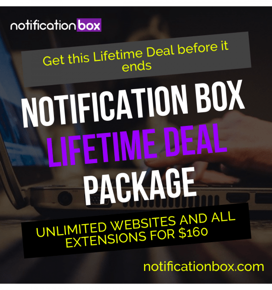
Notification Box Lifetime Deal Package
Original price was: $278.00.$160.00Current price is: $160.00. Add to cart -
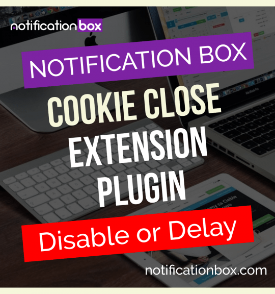
Extension – Cookie Close Notification Box
$19.00 Add to cart -
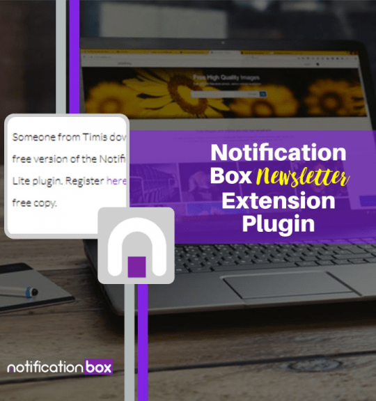
Extension – Notification Box Newsletter
$29.00 Add to cart -
Sale!
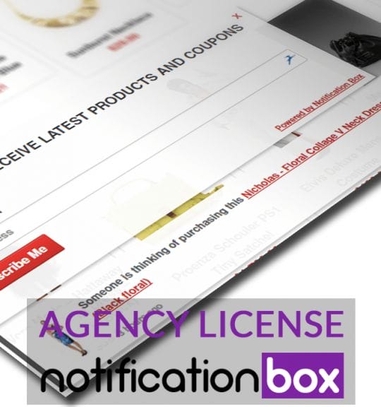
Agency License – Notification Box – WordPress Plugin
Original price was: $230.00.$150.00Current price is: $150.00. Add to cart -
Sale!
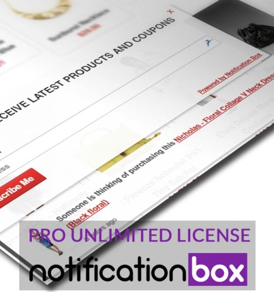
Unlimited License – Notification Box Pro – WordPress Plugin
Original price was: $79.00.$60.00Current price is: $60.00. Add to cart -
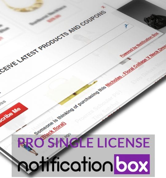
Single License – Notification Box Pro – WordPress Plugin
$39.00 Add to cart
Products
-
Notification Box Lifetime Deal Package
Original price was: $278.00.$160.00Current price is: $160.00.
-
Extension - Cookie Close Notification Box
$19.00
-
Extension - Notification Box Newsletter
$29.00
-
Agency License - Notification Box - WordPress Plugin
Original price was: $230.00.$150.00Current price is: $150.00.
-
Unlimited License - Notification Box Pro - WordPress Plugin
Original price was: $79.00.$60.00Current price is: $60.00.