Blog

Avoid These Notification Box Mistakes for Better Performance
Notification boxes, often referred to as pop-ups, modals, or banners, are elements of a user interface designed to convey information or solicit user interaction. Their effective implementation is crucial for maintaining a positive user experience (UX) and achieving desired actions. Conversely, poorly designed or ill-timed notifications can lead to user frustration, decreased engagement, and ultimately, a negative impact on performance metrics. This article outlines common mistakes in notification box design and deployment, offering strategies for avoidance to optimize their utility.
Deploying a notification without considering the user’s current activity or state is a fundamental error. A notification delivered at an inappropriate moment can be intrusive and disruptive, leading to immediate dismissal or annoyance.
Irrelevant Timing
Presenting a “subscribe to newsletter” notification the moment a user lands on a page, before they have had a chance to engage with content, is often counterproductive. This is akin to a salesperson ambushing a customer before they’ve even browsed the aisles. Users require time to establish intent or interest before being prompted for an action.
- Solution: Implement time-based triggers (e.g., after 30 seconds on page), scroll-based triggers (e.g., after 50% scroll depth), or intent-to-exit triggers. These methods allow users to demonstrate some level of engagement or intent before being interrupted.
Ignoring User Journey Stage
A user’s journey through a website or application dictates the relevance of various notifications. A first-time visitor requires different information than a frequent user or a returning customer with items in their cart.
- Solution: Segment users based on their journey stage. For new users, prioritize onboarding or introductory information. For returning users, consider personalized recommendations or updates relevant to their past activity. For power users, focus on advanced features or productivity tips.
Lack of Personalization
Generic notifications fail to resonate with individual users. A “deal of the day” notification presented to a user who has previously shown interest in specific product categories is a missed opportunity for conversion.
- Solution: Leverage user data (browsing history, purchase history, demographics) to personalize notification content and offers. Dynamic content insertion can significantly increase relevance and click-through rates.
In addition to exploring common notification box mistakes and how to fix them for better performance, you might find it helpful to read about the latest updates in notification box technology. The article on the recent release of Notification Box Version 1.5 provides valuable insights into new features and improvements that can enhance user engagement. You can check it out here: Notification Box Version 1.5 Released. This resource complements the discussion on optimizing notification strategies by highlighting advancements that can lead to more effective communication with your audience.
Poor Design and Usability
The visual presentation and interactive elements of a notification box significantly influence its acceptance and effectiveness. A poorly designed notification can be difficult to read, navigate, or dismiss, creating friction.
Excessive Content and Clutter
A notification box should be concise and focused. Overloading it with too much text, multiple calls to action (CTAs), or irrelevant imagery transforms it from a helpful prompt into an overwhelming obstacle course.
- Solution: Adhere to the principle of “less is more.” Use clear, actionable language. Limit the number of CTAs to one primary action. Employ white space to improve readability. Break down complex information into smaller, digestible chunks if absolutely necessary, offering a “learn more” link rather than embedding all details.
Unclear Call to Action
The primary purpose of most notification boxes is to elicit a specific action from the user. If the CTA is ambiguous, buried, or missing, the user will be left confused about what to do next.
- Solution: Make the CTA prominent, visually distinct, and use action-oriented language (e.g., “Sign Up Now,” “Download,” “Learn More”). Ensure there is only one primary CTA per notification to avoid decision paralysis.
Difficult to Dismiss
A notification that is persistent, lacks a clear close button, or requires complex interactions to dismiss generates frustration. This is analogous to a door without a clear handle. Users should always have a simple and obvious way to close the box.
- Solution: Include a visible “X” icon or a clear “No Thanks” button. Ensure the close mechanism works reliably across all devices. Avoid making users hunt for the dismiss option or forcing them to take an action to close the notification. Escape key functionality should also be considered for desktop users.
Inconsistent Branding
Notifications are an extension of an application’s or website’s interface. Inconsistency in branding (fonts, colors, tone of voice) can create a jarring experience and erode user trust.
- Solution: Maintain adherence to established brand guidelines. Ensure notification boxes visually integrate seamlessly with the overall design. Use consistent language and tone.
Overuse and Frequency

The law of diminishing returns applies acutely to notification boxes. What might be a helpful prompt once becomes a nuisance when repeated excessively.
Notification Fatigue
Bombarding users with a constant stream of notifications, regardless of their relevance, leads to “notification fatigue.” Users become desensitized and will automatically dismiss or ignore all notifications, including those that are genuinely important. This is like the boy who cried wolf; eventually, no one pays attention.
- Solution: Implement intelligent frequency capping. Limit the number of notifications a user receives within a specific timeframe. Prioritize critical notifications over less urgent ones. Consider a “do not disturb” option or granular notification settings for users.
Repetitive Messaging
Displaying the same notification repeatedly, especially after a user has dismissed it, indicates a lack of intelligent design. Users expect their interactions to be remembered.
- Solution: Employ robust tracking mechanisms to remember user interactions. Once a user dismisses a notification, avoid showing it to them again for a set period, or indefinitely if the dismissal implies a disinterest in that specific offer.
Lack of User Control
Users appreciate a sense of agency over their digital environment. The inability to manage notification preferences can be a significant source of frustration, leading to uninstallation or leaving a site.
- Solution: Provide users with explicit control over notification types and frequency through preference settings. Allow them to opt-out of specific categories or all notifications. Transparently explain the value proposition of each notification type.
Technical and Performance Issues

Even perfectly designed notifications can fail if underlying technical problems impede their functionality or impact overall site performance.
Slow Loading Times
A notification box that appears with a noticeable delay, or causes other page elements to load slowly, disrupts the user experience. This can lead to frustration and a higher bounce rate.
- Solution: Optimize notification code and assets for speed. Employ asynchronous loading techniques where possible. Test notification loading times across various network conditions and devices.
Responsiveness Issues
With diverse screen sizes and devices, a notification box that renders poorly or obstructs content on certain devices is a critical failure. This is like a single-size garment that doesn’t fit anyone properly.
- Solution: Design notifications with a mobile-first approach. Ensure they are fully responsive and adapt gracefully to different screen resolutions and orientations. Test thoroughly on a range of devices and browsers.
Accessibility Barriers
Notifications, like all UI elements, must be accessible to users with disabilities. Ignoring accessibility guidelines can exclude a significant portion of the audience and potentially lead to legal complications.
- Solution: Adhere to Web Content Accessibility Guidelines (WCAG). Ensure notifications are keyboard navigable, have sufficient color contrast, and provide alternative text for images. Use ARIA attributes to enhance screen reader compatibility.
In the quest to enhance user engagement, understanding common notification box mistakes is crucial for optimizing performance. For those looking to dive deeper into this topic, a related article discusses the latest features in notification box updates, which can significantly improve mobile display performance. You can read more about these enhancements in the article found here. By addressing these common pitfalls and leveraging new updates, you can ensure your notifications are more effective and user-friendly.
Ignoring User Feedback and Data
| Mistake | Description | Impact on Performance | How to Fix |
|---|---|---|---|
| Overloading with Information | Including too much text or too many options in the notification box. | Users may ignore or close the notification quickly, reducing engagement. | Keep messages concise and focused on a single call to action. |
| Poor Visibility | Notification box blends into the background or is placed in a non-prominent area. | Low click-through rates and missed important messages. | Use contrasting colors and position the box where users naturally look. |
| Lack of Clear Call to Action (CTA) | Notification does not clearly state what the user should do next. | Users may be confused and not take the desired action. | Include a clear, actionable button or link with concise text. |
| Ignoring Mobile Optimization | Notification boxes are not responsive or hard to interact with on mobile devices. | High bounce rates and poor user experience on mobile. | Design responsive notifications that are easy to read and tap on all devices. |
| Too Frequent Notifications | Sending notifications too often, causing annoyance. | Users may disable notifications or leave the site/app. | Limit frequency and allow users to customize notification preferences. |
| Not Testing Different Variations | Using the same notification design and message without A/B testing. | Missed opportunities to improve engagement and conversion rates. | Regularly test different designs, messages, and CTAs to optimize performance. |
Treating notification boxes as static, unchanging elements without continuous evaluation based on user behavior is a missed opportunity for improvement.
Lack of A/B Testing
Guesswork in notification design is inefficient. Without testing different variations, it’s impossible to quantitatively determine what resonates best with the audience.
- Solution: Implement A/B testing for notification headlines, body copy, CTA text, colors, placement, and trigger conditions. Use data from these tests to iterate and optimize for better performance metrics (e.g., conversion rates, engagement).
Not Analyzing Performance Metrics
Deploying notifications without tracking key performance indicators (KPIs) renders them a speculative endeavor. Without data, there’s no way to understand their impact.
- Solution: Track relevant metrics such as impression count, click-through rate (CTR), conversion rate, dismissal rate, and bounce rate. Analyze these metrics to identify underperforming notifications and areas for improvement. Correlate notification performance with overall business objectives.
Failing to Iterate Based on Feedback
User feedback, both explicit (surveys, reviews) and implicit (behavioral data), is a goldmine for improving notification effectiveness. Ignoring this feedback leads to stagnation.
- Solution: Actively solicit user feedback on notifications. Conduct user interviews or usability tests. Use analytics data to understand patterns in user interaction. Regularly review and update notification strategies based on these insights. Consider heatmaps and session recordings to observe how users interact with notifications in real-time.
By meticulously avoiding these common pitfalls, developers and designers can transform notification boxes from potential sources of annoyance into powerful tools for user engagement, information dissemination, and conversion, ultimately enhancing the overall user experience and achieving desired performance outcomes.
TRY NOTIFICATION BOX WORDPRESS PLUGIN
FAQs
What are common mistakes made in notification box design?
Common mistakes include using unclear or vague messages, overloading the box with too much information, poor placement on the screen, lack of visual hierarchy, and not providing actionable options for the user.
How can unclear notification messages affect user experience?
Unclear messages can confuse users, leading to frustration or ignoring important alerts. This reduces the effectiveness of the notification and can negatively impact overall user engagement.
What is the importance of notification box placement?
Proper placement ensures that notifications are noticeable without being intrusive. Poor placement can cause users to miss important information or feel interrupted, which harms usability and performance.
How can I improve the performance of notification boxes?
To improve performance, use concise and clear language, prioritize important information, design with visual hierarchy, place notifications strategically, and include actionable buttons or links when appropriate.
Why should notification boxes avoid information overload?
Information overload can overwhelm users, making it difficult to understand the key message. Keeping notifications simple and focused helps users quickly grasp the information and take necessary actions.
BUY NOW
-
Sale!

Notification Box Lifetime Deal Package
Original price was: $278.00.$160.00Current price is: $160.00. Add to cart -
Extension – Cookie Close Notification Box
$19.00 Add to cart -
Extension – Notification Box Newsletter
$29.00 Add to cart -
Sale!
Agency License – Notification Box – WordPress Plugin
Original price was: $230.00.$150.00Current price is: $150.00. Add to cart -
Sale!
Unlimited License – Notification Box Pro – WordPress Plugin
Original price was: $79.00.$60.00Current price is: $60.00. Add to cart -
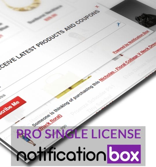
Single License – Notification Box Pro – WordPress Plugin
$39.00 Add to cart

Products
-
Notification Box Lifetime Deal Package
Original price was: $278.00.$160.00Current price is: $160.00.
-
Extension - Cookie Close Notification Box
$19.00
-
Extension - Notification Box Newsletter
$29.00
-
Agency License - Notification Box - WordPress Plugin
Original price was: $230.00.$150.00Current price is: $150.00.
-
Unlimited License - Notification Box Pro - WordPress Plugin
Original price was: $79.00.$60.00Current price is: $60.00.