Blog

Boost Your Website Conversions with These 5 Notification Box Templates
A notification box is a user interface element commonly employed on websites to convey information to visitors. It typically appears as a superimposed window or banner, designed to capture attention without disrupting the primary user experience. These boxes can serve various purposes, from announcing promotions and special offers to gathering feedback or guiding users through specific actions.
The strategic placement and design of notification boxes are crucial for their effectiveness. When implemented thoughtfully, they can act as a helpful guide, pointing users towards valuable content or incentives. Conversely, poorly designed or overly intrusive notification boxes can lead to user frustration and negatively impact engagement.
This article will explore five distinct notification box template types that can be utilized to enhance website conversion rates. Each template will be examined for its structure, potential applications, and best practices for implementation. Understanding these templates can provide a framework for website owners seeking to optimize their online presence and encourage desired user actions.
This template is designed to be a less intrusive method for delivering notifications. It typically resides on the side of the screen, such as the left or right sidebar, and remains visible as the user scrolls through content. Its presence is constant but unobtrusive, serving as a gentle nudge rather than an urgent demand.
Purpose and Functionality
The primary purpose of a subtle sidebar reminder is to keep specific calls to action or important information top-of-mind for the user without interrupting their browsing flow. It functions as a persistent beacon, guiding their attention towards a particular goal. Unlike pop-up notifications, which can be perceived as disruptive, this template aims to integrate information seamlessly into the user’s journey.
Design Considerations
The visual design of a sidebar reminder should prioritize readability and brand consistency. It should be clearly distinguishable from the main content but not overly flashy. Common design elements include:
- Clear Heading: A concise and compelling headline that immediately conveys the notification’s purpose.
- Brief Text: Limited descriptive text that elaborates on the heading and provides essential context.
- Call to Action (CTA) Button: A prominent and actionable button that directs the user to the desired next step. This button should be designed to stand out visually.
- Optional Iconography: Small, relevant icons can sometimes be used to enhance visual appeal and understanding.
- Color Palette: The color scheme should align with the website’s overall branding. Contrasting colors can be used for the CTA button to increase its visibility.
Use Cases
Subtle sidebar reminders are particularly effective for:
- Newsletter Sign-ups: Encouraging visitors to subscribe to email updates. The reminder can offer a small incentive, such as a discount or exclusive content, for signing up.
- Promotional Banners: Displaying ongoing sales, discounts, or limited-time offers. This provides a constant reminder of the opportunity.
- Resource Links: Drawing attention to valuable content like e-books, whitepapers, or case studies that can establish expertise and build leads.
- Social Media Follows: Prompting users to connect with the brand on social platforms.
- App Downloads: Encouraging visitors to download a mobile application.
Optimizing for Conversions
To maximize the conversion potential of a subtle sidebar reminder:
- Placement: Strategically position it on pages where the CTA is most relevant. For instance, a newsletter sign-up box might be best on blog posts or resource pages.
- A/B Testing: Experiment with different headlines, CTA text, and visual elements to identify what resonates best with your audience.
- Value Proposition: Clearly articulate the benefit the user will receive by taking the desired action. The “what’s in it for me?” question should be answered promptly.
- Mobile Responsiveness: Ensure the sidebar is functional and aesthetically pleasing on all screen sizes. It may need to collapse or adapt its layout on smaller devices.
If you’re looking to enhance your website’s conversion rates, you might find inspiration in the article titled “5 High-Converting Notification Box Templates You Can Copy for Your Website.” In addition to exploring effective notification box designs, you can also check out the recent update on notification box features in the article about the Notification Box Version 1.5 Release, which highlights new functionalities that can further boost user engagement and conversions.
2. The Full-Screen Welcome Mat
This template takes a more prominent approach, occupying the entire screen upon a visitor’s arrival. It’s designed to be the first thing a user sees, making a strong initial impression and clearly stating the website’s primary offering or a key message.
Purpose and Functionality
The full-screen welcome mat functions as an introduction, setting the stage for the user’s interaction with the website. It aims to immediately capture attention, communicate a core message, and guide the user towards a specific initial action. This can be particularly useful for new visitors who may not yet understand the site’s value proposition.
Design Considerations
Given its full-screen nature, the design of this template is paramount to avoid overwhelming the user. Key elements include:
- Striking Visuals: High-quality imagery or a short, impactful video can create an immediate emotional connection.
- Concise Headline: A bold and clear headline that encapsulates the essence of the website or the offer being presented.
- Brief Supporting Text: Minimal text is generally preferred, focusing on the most crucial information.
- Prominent CTA: A clear and actionable button that directs the user to their next step. This button should be impossible to miss.
- Escape Mechanism: A well-defined and easily accessible way for users to dismiss the overlay and proceed to the website’s content. This is crucial for user experience.
- Branding Consistency: While designed to be impactful, the aesthetic should still align with the overall brand identity.
Use Cases
This template finds application in scenarios where an immediate and impactful introduction is beneficial:
- Welcome Bonuses/Offers: Presenting a special offer or discount to new visitors upon their first entry.
- Product/Service Introduction: Briefly highlighting a key product or service that the website specializes in.
- Event Announcements: Drawing immediate attention to an upcoming event or webinar.
- Membership/Account Creation Push: Encouraging users to create an account or join a community from the outset.
- Brand Storytelling: Using the full screen to convey a concise brand narrative or mission statement.
Optimizing for Conversions
To enhance the effectiveness of a full-screen welcome mat:
- Speed of Appearance: The notification should appear quickly after the page loads, before the user has a chance to navigate away.
- Relevance to Traffic Source: Consider triggering this overlay based on how the user arrived at the site. For example, a visitor from a specific ad campaign might see a tailored welcome message.
- Clear Value Exchange: The benefit of engaging with the CTA should be immediately apparent. Are they getting a discount, exclusive access, or valuable information?
- Exit Intent Integration: This template can be further enhanced by triggering it as a user’s mouse cursor moves towards leaving the browser window (exit intent).
- Frequency Capping: Implement mechanisms to avoid showing the welcome mat to the same user repeatedly, which can be highly annoying.
3. The Smart Exit-Intent Teaser
This notification box is designed to appear as a user is about to leave the website. It leverages exit-intent technology, which detects when a user’s cursor is moving towards the browser’s close button or tabs, signaling an intention to depart. The goal is to offer a final incentive or piece of information to encourage them to stay.
Purpose and Functionality
The smart exit-intent teaser acts as a last-ditch effort to retain a visitor and prevent them from leaving without taking a desired action. It’s like a shopkeeper offering a final discount as a customer walks out the door, hoping to entice them back at the last moment. This template seeks to understand the user’s potential reason for leaving and provide a relevant solution or enticement.
Design Considerations
The design should be compelling and offer a clear, immediate benefit:
- Urgent but Polite Tone: The language should convey a sense of urgency for the offer but remain respectful of the user’s potential decision to leave.
- Strong Incentive: The offer presented should be sufficiently attractive to counteract the user’s intention to depart. Examples include discounts, free shipping, or exclusive content.
- Compelling Headline: A headline that grabs attention and highlights the time-sensitive nature or high value of the offer.
- Clear Call to Action: A prominent button that makes it easy for the user to claim the offer or take the desired action.
- Minimal Distraction: While designed to be noticed, it should avoid being overly aggressive or obstructive. The aim is to present an opportunity, not to trap the user.
- Optional Countdown Timer: For time-sensitive offers, a countdown timer can amplify the sense of urgency.
Use Cases
Exit-intent teasers are particularly effective for:
- Cart Abandonment Recovery: Offering a discount or free shipping to users who are about to leave their shopping cart without completing the purchase.
- Lead Generation: Providing a last-minute incentive for users to sign up for a newsletter or download a lead magnet before exiting.
- Special Offer Expiration: Reminding users of a limited-time promotion that is about to end.
- Content Engagement: Offering a related resource or a prompt to explore more content to keep users on the site.
- Service Sign-ups: Enticing users considering a service to finalize their decision with a final perk.
Optimizing for Conversions
To maximize the conversion rate of an exit-intent teaser:
- Analyze User Behavior: Understand the typical reasons for user departure from your site and tailor the offers accordingly. A user leaving a product page might need a discount on that specific item, while someone leaving the checkout might need a shipping incentive.
- Personalization: If possible, personalize the offer based on user data, such as items in their cart or browsing history.
- Offer Value: Ensure the incentive provided is genuinely valuable and compelling enough to change the user’s mind.
- Testing Variations: Experiment with different offers, headlines, and CTAs to see what generates the highest conversion rates.
- Frequency Control: Implement rules to prevent the same exit-intent notification from appearing too frequently to a single user, which can become irritating and counterproductive.
4. The Interactive Feedback Widget

This template is not primarily focused on immediate sales or sign-ups but rather on gathering valuable insights from website visitors. It appears as a smaller, often less intrusive element, designed to solicit opinions, preferences, or general feedback.
Purpose and Functionality
The interactive feedback widget serves as a direct line of communication between the website owner and its audience. It allows for the collection of qualitative and quantitative data that can inform website improvements, product development, and marketing strategies. This acts as a listening post, enabling the website to understand its visitors more deeply.
Design Considerations
The design should encourage participation and make the feedback process simple:
- Minimalist Design: Often appearing as a small tab or button on the edge of the screen, it doesn’t dominate the user’s view.
- Clear Question/Prompt: A concise and direct question that guides the user on what feedback is being sought.
- User-Friendly Input Method: This could be a simple rating scale (e.g., 1-5 stars), multiple-choice questions, or a text box for open-ended responses.
- Optional Anonymity: Offering the option for anonymous feedback can encourage more honest and candid responses.
- Thank You Message: A brief acknowledgment and thank you upon completion of the feedback process shows appreciation for the user’s time.
- Contextual Relevance: The widget can be designed to appear contextually on specific pages to gather feedback related to that particular content or feature.
Use Cases
Interactive feedback widgets are ideal for:
- User Experience (UX) Surveys: Gathering immediate opinions on website navigation, design, or usability.
- Product/Service Satisfaction: Asking users about their experience with a specific product or service.
- Content Engagement: Gauging how useful or engaging specific blog posts, articles, or videos are.
- Feature Requests: Allowing users to suggest new features or improvements.
- General Website Feedback: Providing an open channel for users to share any thoughts or suggestions.
- Customer Support Insights: Asking about the user’s experience with customer service.
Optimizing for Conversions
To maximize the utility of interactive feedback widgets:
- Targeted Questions: Tailor the questions to the specific information you aim to collect. Don’t ask too many questions at once, as this can lead to fatigue.
- Timing is Key: Trigger the widget at appropriate times. For example, after a user has spent a significant amount of time on a page, or after they have interacted with a specific feature.
- Act on Feedback: This is perhaps the most crucial step. Regularly review the feedback received and implement changes based on the insights gained. Communicate these changes back to your audience to show their input is valued.
- A/B Testing Questions: Experiment with different wording for your questions and different types of input mechanisms to see what yields the most valuable responses.
- Incentives for Participation: While not always necessary, small incentives like entry into a prize draw or a small discount code can increase participation rates for more in-depth surveys.
If you’re looking to enhance your website’s engagement and conversion rates, exploring effective notification box templates can be incredibly beneficial. A related article that delves deeper into the topic is available at Launching the Notification Box, which provides insights on how to implement these tools effectively. By utilizing high-converting notification boxes, you can significantly improve user interaction and drive more conversions on your site.
5. The Embedded Content Enhancer
| Template Name | Conversion Rate | Primary Use | Color Scheme | Call to Action | Best For |
|---|---|---|---|---|---|
| Urgent Sale Alert | 12.5% | Promoting limited-time offers | Red and White | Shop Now | Flash sales and discounts |
| New Arrival Announcement | 9.8% | Highlighting new products | Blue and Grey | Explore | Product launches |
| Newsletter Signup | 15.2% | Growing email list | Green and White | Subscribe | Lead generation |
| Free Trial Offer | 14.1% | Encouraging sign-ups | Orange and Black | Start Free Trial | SaaS and software |
| Social Proof Notification | 11.3% | Building trust with visitors | Yellow and Dark Grey | See Reviews | Service-based businesses |
This template is integrated directly within the content of a webpage, often appearing as a styled box or section that breaks the flow of text to highlight specific information or offer an interactive element. It’s less of an overlay and more of a native addition to the page’s structure.
Purpose and Functionality
The embedded content enhancer serves to enrich the user’s experience by presenting supplementary information or interactive elements in a focused manner. It acts as a spotlight within the narrative, drawing attention to crucial details or providing tools that enhance understanding and engagement. This template aims to add value without disrupting the primary reading or browsing experience significantly.
Design Considerations
The design should be clear, visually appealing, and clearly demarcate the embedded content from the surrounding text:
- Contrasting Background: A distinct background color or style helps it stand out from the main body of text.
- Clear Heading/Title: A title that immediately communicates the purpose of the embedded content.
- Concise and Focused Content: The information within the enhancer should be presented directly and efficiently, avoiding jargon or unnecessary verbosity.
- Visual Aids: Images, infographics, or short videos can be effectively used to illustrate points or break down complex information.
- Interactive Elements: This could include simple quizzes, calculators, form fields, or links to related resources.
- Call to Action (Optional): If applicable, a CTA button can be included to direct users to further action related to the embedded content.
- Callout Styling: Often uses borders, drop shadows, or different font styles to differentiate it from the main content.
Use Cases
Embedded content enhancers are versatile and can be used for a variety of purposes:
- Key Takeaway Boxes: Summarizing the most important points of an article or section.
- Fact Boxes/Statistics: Presenting compelling data or interesting facts in an easily digestible format.
- Glossary/Definitions: Providing quick explanations of technical terms or jargon used within the content.
- Interactive Calculators/Tools: Offering visitors tools relevant to the content, such as a mortgage calculator on a finance blog or a BMI calculator on a health website.
- Resource Links/Further Reading: Suggesting related articles, guides, or external resources.
- Lead Magnet Offers: Discreetly offering an e-book or checklist related to the content’s topic.
- Product Spotlights: Highlighting a specific product relevant to the content being discussed.
Optimizing for Conversions
To maximize the effectiveness of an embedded content enhancer:
- Relevance is Paramount: The embedded content must be highly relevant to the surrounding text and the user’s current interest. If it feels out of place, it will be ignored.
- Value Proposition: The information or tool provided must offer clear value to the reader. Why should they interact with it?
- Design for Scannability: Users should be able to quickly scan the content within the enhancer and grasp its essence.
- Strategic Placement: Position the enhancer at natural breaks in the content where it can effectively draw attention without seeming forced.
- A/B Testing Content: Experiment with different types of embedded content, headings, and CTAs to see what best captures user attention and drives engagement. Consider testing different visual treatments as well.
- Mobile Adaptation: Ensure the embedded content scales and displays correctly on mobile devices, maintaining its readability and interactive functionality.
TRY NOTIFICATION BOX WORDPRESS PLUGIN
FAQs
What is a notification box on a website?
A notification box is a small, prominent message area on a website designed to grab visitors’ attention. It typically displays important information, alerts, promotions, or calls to action to encourage user engagement.
Why are high-converting notification box templates important?
High-converting notification box templates are important because they are optimized to increase user interaction, such as clicks or sign-ups. Using proven templates can help improve conversion rates by effectively communicating messages and prompting desired actions.
Can I customize notification box templates for my website?
Yes, most notification box templates are customizable. You can adjust colors, text, size, placement, and behavior to match your website’s branding and specific goals while maintaining their high-conversion design elements.
Where should I place notification boxes on my website for best results?
Notification boxes are most effective when placed in visible areas such as the top header, bottom bar, or near key content sections. Placement depends on the message type and user flow, but it should not disrupt the user experience.
Are there any tools to help me implement notification box templates easily?
Yes, many website builders and marketing platforms offer built-in notification box features or plugins. These tools often provide ready-made templates that you can easily customize and integrate without needing advanced coding skills.
BUY NOW
-
Sale!

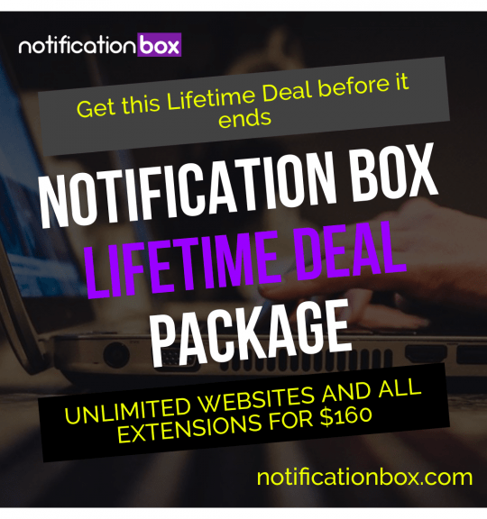
Notification Box Lifetime Deal Package
Original price was: $278.00.$160.00Current price is: $160.00. Add to cart -
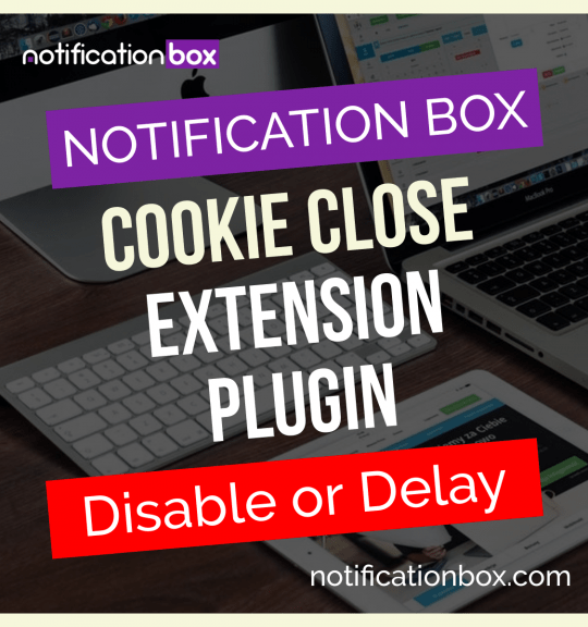
Extension – Cookie Close Notification Box
$19.00 Add to cart -
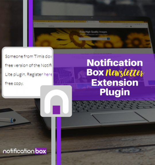
Extension – Notification Box Newsletter
$29.00 Add to cart -
Sale!
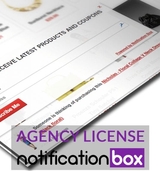
Agency License – Notification Box – WordPress Plugin
Original price was: $230.00.$150.00Current price is: $150.00. Add to cart -
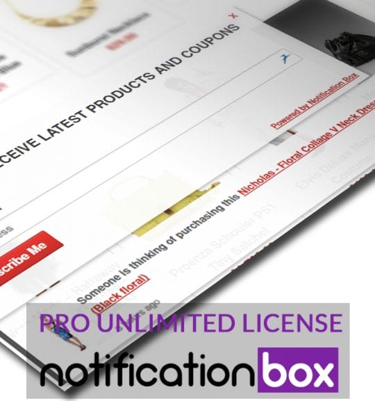
Sale!
Unlimited License – Notification Box Pro – WordPress Plugin
Original price was: $79.00.$60.00Current price is: $60.00. Add to cart -
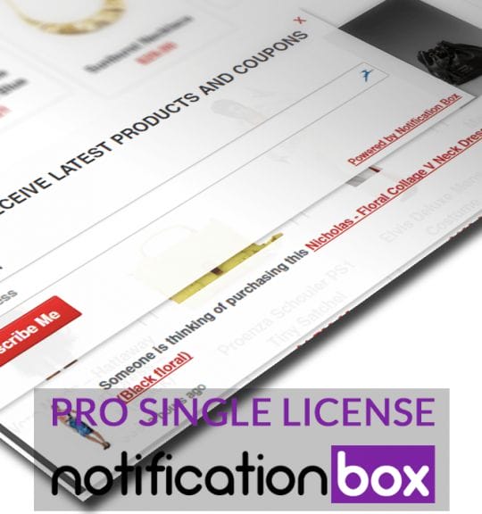
Single License – Notification Box Pro – WordPress Plugin
$39.00 Add to cart
Products
-
Notification Box Lifetime Deal Package
Original price was: $278.00.$160.00Current price is: $160.00.
-
Extension - Cookie Close Notification Box
$19.00
-
Extension - Notification Box Newsletter
$29.00
-
Agency License - Notification Box - WordPress Plugin
Original price was: $230.00.$150.00Current price is: $150.00.
-
Unlimited License - Notification Box Pro - WordPress Plugin
Original price was: $79.00.$60.00Current price is: $60.00.