Blog

Crafting Compelling Notification Box Messages: From Zero to Hero!
Notification boxes serve as critical communication channels between a system and its user. They are transient, often appearing and disappearing without direct user interaction, yet carry the potential to significantly impact user experience and action. Effective notification box design and messaging are not merely about aesthetics; they are about conveying information with clarity, urgency, and relevance, all within strict spatial and temporal constraints. This section explores the fundamental principles governing notification boxes and their role in the user interface.
The Purpose of a Notification Box
A notification box primarily aims to inform a user about an event, status change, or required action. Its purpose can range from benign informational updates to critical alerts demanding immediate attention. Consider a notification from an e-commerce platform stating, “Your order has been shipped.” This provides a status update, offering reassurance. Conversely, a banking application might display, “Unusual activity detected on your account,” which demands a specific, and often urgent, response. The intent behind the notification dictates its design, placement, and most importantly, its message.
Types of Notification Boxes
Notification boxes can be categorized by their urgency and impact on user workflow. Understanding these categories is crucial for crafting appropriately toned messages.
- Informational Notifications: These convey non-critical updates. They inform but do not demand immediate action. Examples include successful data saves, new message alerts, or system updates. These are often transient and may fade without user interaction.
- Warning Notifications: These indicate a potential issue or a situation that might require attention, though not necessarily immediate action. They serve as a heads-up. Examples include low battery warnings or approaching subscription renewal dates. They often encourage proactive behavior.
- Error Notifications: These signify a problem that has occurred, often preventing a desired action or indicating system malfunction. They frequently require user intervention to resolve. Examples include “Invalid password” or “Connection lost.”
- Success Notifications: These confirm the successful completion of an action initiated by the user or the system. They provide positive reinforcement and closure. Examples include “File uploaded successfully” or “Settings saved.”
- Critical Alerts: These are high-priority notifications demanding immediate attention due to severe consequences if ignored. They may interrupt workflows and require explicit user acknowledgment. Examples include security breaches or critical system failures.
The Anatomy of a Notification Box
Beyond the message, a notification box comprises several elements that contribute to its overall efficacy.
- Visual Cues: Icons, colors, and animations play a significant role in conveying urgency and type. A red icon often indicates an error or critical alert, while a green icon signifies success.
- Placement and Duration: The location of the notification (e.g., top-right corner, center of the screen) and how long it remains visible impact its prominence and user interaction. A transient success message may quickly vanish, while a critical error might persist until acknowledged.
- Actionable Elements: Where appropriate, notification boxes can include buttons or links that allow a user to respond directly, such as “View Details,” “Dismiss,” or “Update Now.” This transforms a passive message into an interactive tool.
In addition to exploring strategies for enhancing click-through rates in “From Zero to Hero: Optimizing Notification Box Messages for Higher Click-Through Rates,” readers may find valuable insights in the article on notification box extensions, newsletters, and cookies. This resource delves into how effective notification strategies can further engage users and improve overall communication. For more information, you can read the article here: Notification Box Extensions, Newsletter, and Cookies.
The Art of Conciseness: Distilling Your Message
In the constrained canvas of a notification box, every word counts. Conciseness is not merely about brevity, but about maximizing information density while maintaining clarity. Think of it as a telegram; extraneous words dilute the message and waste precious cognitive load. This section delves into strategies for achieving impactful brevity.
Prioritizing Key Information
Before you write, identify the absolute core of your message. What is the single most important piece of information the user needs to grasp immediately? All other details are secondary and can often be omitted or deferred to a linked resource. For example, instead of “Due to an unanticipated power outage affecting our server infrastructure in the Eastern European region, services may experience intermittent disruptions for the next 2-4 hours,” opt for “System maintenance: Intermittent service disruptions expected.” The “why” and “where” can be provided upon request or in a linked status page.
Eliminating Redundancy
Avoid repeating information that is already implied or conveyed visually. If an icon clearly signifies an error, there’s no need to start your message with “Error:” Instead, get straight to the specific problem. Similarly, if the notification appears immediately after a user action, you may not need to explicitly state “You have successfully…” as the context provides that information.
Using Active Voice and Direct Language
Active voice generally leads to more concise and direct statements. “Your file was uploaded successfully” is more impactful than “The file upload process was successfully completed by the system.” Similarly, use plain, unambiguous language. Avoid jargon or technical terms unless your target audience is highly specialized. For instance, “Reboot your router” is clearer than “Initiate a cyclical power state transition on your network access device.”
The Power of Verbs
Strong verbs convey action and meaning efficiently. Instead of “There is a need for you to update your profile,” use “Update your profile.” Verbs drive the message forward, reducing the reliance on passive constructions and weak adjectives.
Crafting Microcopy for Actionable Context
If a notification includes an action button, the text on that button is part of your concise message. “Learn More” is often better than “Click Here to Read Additional Information.” The button text should clearly indicate the outcome of interaction without needing further explanation.
Clarity and Comprehensibility: Building a Bridge of Understanding

A concise message without clarity is just noise. Your goal is to construct a message that leaves no room for ambiguity, ensuring the user understands what happened, why it happened, and what, if anything, they need to do next. Think of your notification as a clear pane of glass; the user should see through it directly to the information.
Avoiding Ambiguity and Jargon
Ambiguity leads to user frustration and potential inaction. Avoid terms that could be interpreted in multiple ways or technical jargon that is not universally understood by your audience. For example, “System offline” might be ambiguous. Is it completely down, or just a specific module? “Database unavailable for read/write operations” is more precise, though potentially too technical for a general user. A good compromise might be “Account data temporarily unavailable.” Similarly, avoid internal acronyms unless they are widely used and understood by your user base.
Explaining “Why” (When Necessary)
While conciseness is paramount, sometimes providing a brief “why” enhances understanding and reduces user anxiety. If a connection fails, simply saying “Connection failed” might lead to a user trying again repeatedly. Adding “due to network instability” provides context, suggesting the issue might be external and persistent. The key is to be selective; not every event requires a “why.”
Providing Clear Next Steps or Actions
For actionable notifications, clearly stating what the user needs to do is critical. This transforms a passive message into an interactive one. Instead of “Your account needs attention,” which is vague, use “Verify your email address to activate your account” or “Please update your payment information.” If no action is required, state that explicitly: “No action needed.”
Considering the User’s Mental Model
Users approach your system with a pre-existing mental model of how things should work. Notifications should align with or subtly guide this model. If a user expects immediate confirmation after ordering, a “Order confirmed! We’ll send shipping details soon” notification reinforces their expectation positively. If an action they expect to be instantaneous takes time, informing them “Processing your request, this may take a few minutes” manages expectations.
Accessibility Considerations
Clarity also extends to accessibility. Ensure your language is straightforward and can be easily understood by users with cognitive disabilities. Avoid complex sentence structures or overly abstract concepts. Messages should be easily parsable by screen readers and other assistive technologies.
Tone and Empathy: Speaking as a Human

Even in a digital interface, users respond to messages that feel human. The tone of your notification can significantly influence how a user perceives the message and, by extension, the system itself. Empathy in messaging means understanding the user’s potential emotional state when they receive a notification and crafting your words accordingly.
Matching Tone to Message Type
The tone should always align with the type and severity of the notification.
- Informational/Success: A positive, reassuring, or neutral tone is appropriate here. “Welcome aboard!” or “Your changes have been saved.”
- Warning: A slightly cautious or serious but not alarmist tone. “Your trial expires in 3 days.”
- Error/Critical: A clear, serious, but empathetic tone. Avoid being accusatory. Focus on the problem and the path to resolution. “We encountered an issue processing your payment.” instead of “Payment failed.”
Avoiding Blame and Apologies (When Appropriate)
When an error occurs, the primary goal is resolution, not assigning blame. Focus on the problem, not the user’s perceived mistake. Instead of “You entered an invalid password,” consider “Incorrect password.” Apologies should be genuine and reserved for situations where the system has genuinely inconvenienced the user, not for user error. Over-apologizing can dilute the impact of an apology when it’s truly warranted. If your system genuinely malfunctioned, then “We apologize for the inconvenience, our servers are temporarily unavailable” is appropriate.
Using Consistent Voice and Personality
Maintain a consistent voice across all your notifications. Is your system formal or informal? Friendly or authoritative? Whatever you choose, ensure it’s applied consistently to build trust and familiarity. A system that uses casual language for success messages but suddenly becomes highly formal for error messages can be jarring.
Humanizing Error Messages
Errors are inevitable. How you communicate them can distinguish between a frustrating experience and a manageable one. Empathy here means acknowledging the user’s likely frustration and providing a clear path forward. Instead of “Error 404: Page not found,” which is purely technical, consider “Oops! This page doesn’t exist. Would you like to go to the homepage?”
The Role of Micro-Interactions in Tone
The small animations or sounds accompanying a notification also contribute to its perceived tone. A gentle chime for a new message versus an urgent siren for a critical alert further reinforces the message’s emotional impact.
In the quest to enhance user engagement, the article “From Zero to Hero: Optimizing Notification Box Messages for Higher Click-Through Rates” provides valuable insights into crafting effective notifications. For those looking to expand their knowledge on monetizing such strategies, a related resource can be found in the article on affiliate opportunities available at Notification Box, which explores how to leverage notification boxes for additional revenue streams.
Iteration and Testing: Refining Your Communication
| Metric | Before Optimization | After Optimization | Improvement |
|---|---|---|---|
| Click-Through Rate (CTR) | 2.5% | 7.8% | +212% |
| Average Time on Notification | 3.2 seconds | 6.5 seconds | +103% |
| Notification Impressions | 10,000 | 10,000 | 0% |
| Conversion Rate from Notification | 1.1% | 3.4% | +209% |
| Bounce Rate after Click | 45% | 30% | -33% |
Crafting compelling notification messages is not a one-time task; it’s an ongoing process of refinement. Like any other aspect of user experience design, notification messaging benefits from iteration, user feedback, and data-driven analysis. Think of it as sculpting; you chip away at the unnecessary and refine the essential.
A/B Testing Message Variations
Different phrasing can lead to vastly different user behaviors. A/B testing allows you to compare the performance of multiple message variations against a defined metric, such as click-through rates, task completion, or dismissal rates. For example, test “Update now for new features” against “Discover new features: Update your app.” The results will indicate which message resonates more effectively with your audience.
Gathering User Feedback
Direct feedback from users is invaluable. Conduct usability tests where users explicitly comment on the clarity and helpfulness of notifications. Include questions about notifications in surveys. Pay attention to support tickets related to confusion or frustration arising from specific notifications. This qualitative data provides insights that quantitative metrics might miss, such as emotional responses or unintended interpretations.
Analyzing Notification Engagement Metrics
Track how users interact with your notifications. Relevant metrics include:
- Dismissal Rate: How often are notifications dismissed without interaction? A high dismissal rate could indicate irrelevance or a lack of clarity regarding the message’s importance.
- Click-Through Rate (CTR): For actionable notifications, how often do users click on the embedded action? A low CTR suggests the call to action might not be compelling or clear.
- Task Completion Rate: For notifications guiding a user through a process, what percentage of users successfully complete the task after receiving the notification?
- Time to Action: How quickly do users respond to actionable notifications? This can indicate urgency and clarity.
The Importance of Contextual Testing
A notification’s effectiveness can change dramatically based on the user’s current situation and state of mind. Test notifications within their natural operational context. A notification that seems clear in isolation might be confusing when the user is simultaneously engaged in a complex task. Simulate realistic user scenarios to assess comprehension and impact.
Establishing a Style Guide for Notifications
To ensure consistency in tone, voice, and message structure, develop a dedicated style guide for notifications. This document should outline:
- Approved terminology: What terms to use and which to avoid.
- Tone guidelines: When to be formal, informal, urgent, or reassuring.
- Message length constraints: Character or word limits for different notification types.
- Call-to-action best practices: How to phrase buttons and links.
- Error message templates: Standard structures for common error scenarios.
This ensures that regardless of who is writing the notification, it adheres to established communication standards, creating a seamless and predictable user experience. By continuously iterating and incorporating feedback, your notification messages evolve from functional alerts into refined tools that genuinely enhance the user’s interaction with your system.
TRY NOTIFICATION BOX WORDPRESS PLUGIN
FAQs
What is the main goal of optimizing notification box messages?
The main goal of optimizing notification box messages is to increase click-through rates by making the messages more engaging, clear, and relevant to the audience.
What elements should be considered when creating effective notification messages?
Effective notification messages should consider elements such as concise wording, a clear call-to-action, timing, personalization, and visual appeal to capture the user’s attention.
How does personalization impact the effectiveness of notification messages?
Personalization makes notification messages more relevant to the recipient, which can significantly improve engagement and click-through rates by addressing the user’s specific interests or behaviors.
Why is timing important in sending notification box messages?
Timing is crucial because sending notifications at the right moment increases the likelihood that users will see and interact with the message, thereby improving click-through rates.
Can A/B testing help in optimizing notification box messages?
Yes, A/B testing allows you to compare different versions of notification messages to determine which one performs better, enabling data-driven decisions to optimize click-through rates.
BUY NOW
-
Sale!

Notification Box Lifetime Deal Package
Original price was: $278.00.$160.00Current price is: $160.00. Add to cart -
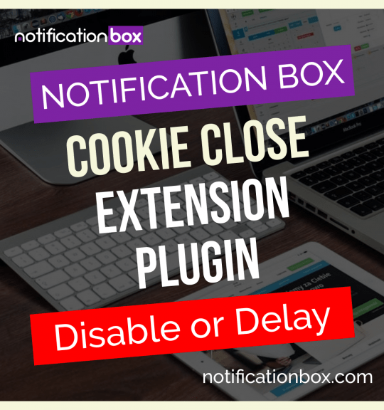
Extension – Cookie Close Notification Box
$19.00 Add to cart -
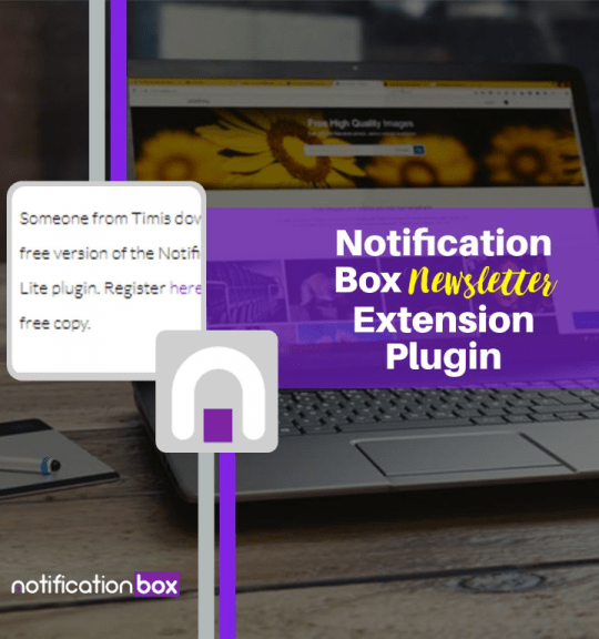
Extension – Notification Box Newsletter
$29.00 Add to cart -
Sale!
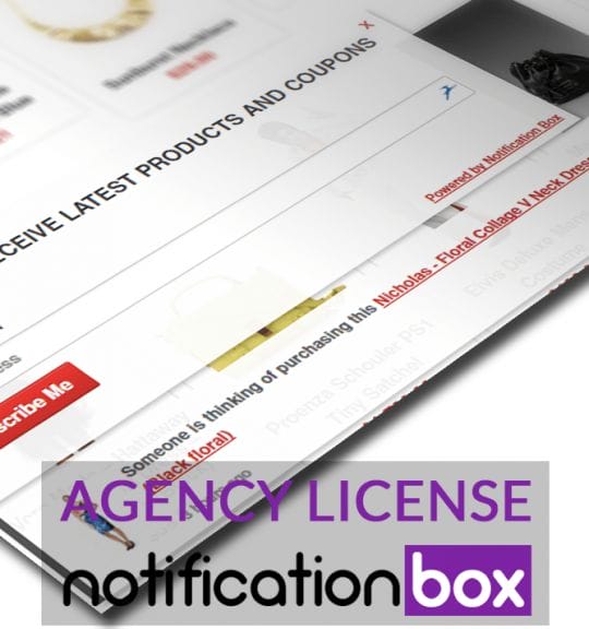
Agency License – Notification Box – WordPress Plugin
Original price was: $230.00.$150.00Current price is: $150.00. Add to cart -
Sale!
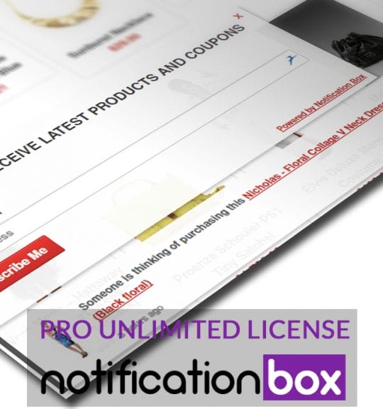
Unlimited License – Notification Box Pro – WordPress Plugin
Original price was: $79.00.$60.00Current price is: $60.00. Add to cart -
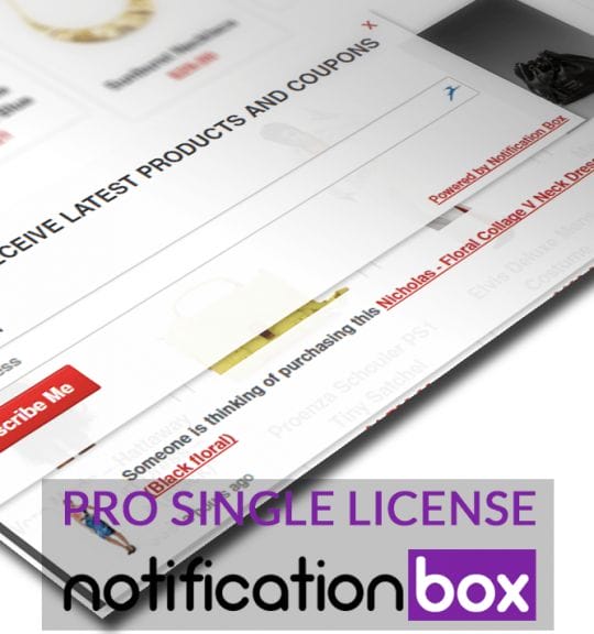
Single License – Notification Box Pro – WordPress Plugin
$39.00 Add to cart

Products
-
Notification Box Lifetime Deal Package
Original price was: $278.00.$160.00Current price is: $160.00.
-
Extension - Cookie Close Notification Box
$19.00
-
Extension - Notification Box Newsletter
$29.00
-
Agency License - Notification Box - WordPress Plugin
Original price was: $230.00.$150.00Current price is: $150.00.
-
Unlimited License - Notification Box Pro - WordPress Plugin
Original price was: $79.00.$60.00Current price is: $60.00.