Blog

Effective Non-Intrusive Notification Box Popups: Best Practices
The implementation of notification boxes and pop-ups on websites and applications presents a significant challenge: how to effectively convey information without disrupting the user experience. This article examines best practices for designing and deploying non-intrusive notification boxes, focusing on techniques that respect user autonomy and minimize friction.
Digital notifications serve various purposes, from conveying critical system alerts to offering promotional content. Their effectiveness hinges on a delicate balance between visibility and unobtrusiveness. A poorly implemented notification can lead to user frustration, decreased engagement, and a negative perception of the platform. Conversely, a well-designed notification can enhance usability, provide timely assistance, and drive desired user actions.
Types of Notifications
Notifications can be broadly categorized based on their urgency and intent. Understanding these distinctions is crucial for selecting the appropriate display mechanism and design.
System Alerts
These notifications convey essential information regarding system status, security, or critical errors. They often require immediate user attention and may prevent further interaction until acknowledged. Examples include error messages during form submission or security warnings regarding unusual account activity. Their design prioritizes clarity and directness.
Informational Updates
Informational updates provide non-critical but useful information. These might include confirmation of an action, progress updates for a background task, or announcements of new features. They aim to keep the user informed without demanding immediate interaction.
Promotional and Marketing Messages
These notifications are designed to drive specific user behaviors, such as subscribing to a newsletter, making a purchase, or engaging with new content. Their design often incorporates persuasive language and calls to action, while still striving for minimal invasiveness.
Feedback and Interaction Prompts
Feedback prompts solicit user input, such as rating an app, providing a review, or participating in a survey. Interaction prompts encourage further engagement, like inviting users to explore related content or use a new feature. These notifications often appear after a specific user action or period of inactivity.
The Impact of Intrusiveness
Intrusiveness in notifications manifests in various ways. A notification that obscures content, prevents interaction, or constantly reappears without cause can significantly degrade the user experience. High levels of intrusiveness can lead to:
- Increased Bounce Rates: Users may abandon a site or application if regularly confronted with disruptive notifications.
- Notification Fatigue: Constant alerts can desensitize users to important messages, leading them to ignore all notifications.
- Negative Brand Perception: A platform perceived as overly aggressive in its notification strategy can foster distrust and dissatisfaction.
- Reduced Productivity: Interruptions from intrusive notifications can break user focus and hinder task completion.
The goal, therefore, is to create notifications that are akin to a helpful guide rather than an insistent hawker.
For those looking to enhance their understanding of effective notification box popups, a related article titled “Notification Box Version 1.7 Released: Mobile Display” provides valuable insights into the latest features and improvements that can help streamline user experience. You can read more about it by following this link: Notification Box Version 1.7 Released: Mobile Display. This article complements the best practices for designing non-intrusive notification box popups by highlighting how mobile display enhancements can lead to better engagement and user satisfaction.
Design Principles for Non-Intrusive Notifications
Effective non-intrusive notifications adhere to a set of core design principles that prioritize user control and contextual relevance.
Contextual Relevance
A notification’s effectiveness is directly proportional to its relevance to the user’s current activity or state. Presenting an irrelevant notification is akin to shouting information at someone who is already engaged in a focused conversation; it is likely to be ignored or resented.
Timing is Key
Notifications should appear at precisely the moment they are most useful. For instance, a “save your work” reminder is highly relevant before a user navigates away from an unsaved document. A prompt to rate an app is best presented after a positive interaction or a period of stable usage, not immediately upon launch. Unsolicited, untargeted alerts, especially for marketing, are often counterproductive.
User Segmentation
Leverage user data and behavior to tailor notifications. A new user might receive onboarding tips, while a returning user could be informed about personalized recommendations. Different user segments have different needs and priorities, and notifications should reflect these distinctions. This segmentation ensures that messages resonate with their intended audience.
Clarity and Conciseness
The message within a notification must be immediately understandable and free of jargon. Users typically scan notifications rather than reading them thoroughly. Every word should contribute to the message’s comprehension.
Direct Language
Use clear, unambiguous language. Avoid passive voice or overly complex sentence structures. State the purpose of the notification directly. For example, instead of “It has come to our attention that your session may be expiring,” consider “Your session will expire soon.”
Actionable Content
If the notification requires user action, make that action explicit and provide a clear call to action (CTA). Buttons should be clearly labeled and their function self-evident. A notification that states “Something went wrong” without providing options for resolution is unhelpful. Instead, “Error: Payment failed. Please try again or contact support.” is more effective.
User Control and Opt-Out Mechanisms
Providing users with control over their notification experience is paramount. This empowers them and reduces the likelihood of frustration.
Easy Dismissal
Users should be able to easily dismiss or close a notification. This might involve a prominent “X” icon, an “OK” button, or an ability to click outside the notification area to close it. For less critical notifications, automatic dismissal after a short period can be appropriate.
Notification Preferences
Offer granular control over notification types. Allow users to specify which types of notifications they wish to receive, their frequency, and even the channels through which they are delivered (e.g., email, in-app, push). This allows users to curate their notification stream to their liking.
Snooze Options
For notifications that are important but not urgent, a “snooze” option can be valuable. This allows users to temporarily dismiss a notification and have it reappear at a later, more convenient time. This respects their current focus while ensuring the message is not lost.
Strategic Placement and Presentation

The visual design and placement of a notification significantly influence its intrusiveness and effectiveness. A notification’s “loudness” can be modulated through these strategic choices.
Non-Modal vs. Modal Notifications
A crucial distinction lies between modal and non-modal notifications, dictating the level of interruption.
Non-Modal Notifications
These notifications do not prevent users from interacting with the underlying content. They appear, convey their message, and then often disappear or move to a less prominent location. Examples include toast messages (small, temporary alerts that “toast” up from the bottom), snackbars (similar to toasts but often with a single action), and subtle banners. These are ideal for non-critical information or confirmations.
- Toast Messages/Snackbars: Brief, transient, and often appear at the bottom or top of the screen. They convey a quick confirmation (e.g., “Item added to cart”) and typically disappear automatically within a few seconds. Their nature is inherently non-disruptive.
- Banner Notifications: Appear at the top or bottom of the screen, pushing content slightly or overlaying it without preventing interaction. They can be for site-wide announcements (e.g., “Scheduled maintenance”) and often include a dismiss button.
Modal Notifications
These notifications obscure the underlying content and require user interaction before the user can proceed. They create a temporary “modal state” where the application’s flow is paused. Modal notifications should be reserved for critical information that truly demands immediate attention and acknowledgment, such as security alerts or unrecoverable error messages.
- Dialogue Boxes: The quintessential modal notification. They present a clear message and typically offer one or more action buttons. Their use should be sparing to avoid user frustration.
- Full-Screen Overlays: While often used for marketing, true modal pop-ups that take over the entire screen are highly disruptive. Their use should be strictly limited to essential, high-priority interactions that cannot be handled otherwise.
Visual Design and Aesthetics
The visual presentation of a notification contributes to its perceived intrusiveness. A well-designed notification can be less jarring than a poorly designed one, even if it occupies similar screen space.
Subtle Animation
Subtle animations for entry and exit can make notifications feel less abrupt. A gentle fade-in or a smooth slide can be more appealing than an instant appearance and disappearance. Overly elaborate animations, however, can become distracting.
Consistent Branding
Notifications should align with the overall visual identity of the website or application. Consistent branding helps users recognize the notification as legitimate and part of the platform. Deviations in style can lead to distrust or confusion.
Prioritization Through Visual Cues
Use color, icons, and typography to convey urgency or importance. Red might indicate an error, while green could signify success. However, rely on universal design principles and avoid excessive use of bold, aggressive styling that can be perceived as shouting. Icons can provide visual shorthand, quickly communicating the purpose of the notification.
A/B Testing and Iteration

The effectiveness of notification strategies is not static. User expectations evolve, and what works for one audience may not work for another. Continuous testing and iteration are vital.
Experimentation with Timing and Frequency
A/B test different timings for specific notifications. Does a promotional offer perform better if shown after 30 seconds on a page or after a user scrolls halfway down? Experiment with frequency caps so that users are not overwhelmed by the same notification repeatedly.
Alternative Message Formulations
Test different wording for the same message. A slight change in phrasing can significantly impact user engagement or comprehension. For example, “Join our newsletter for updates” versus “Stay informed: Get exclusive content delivered weekly.”
Placement Variations
Experiment with different placements for non-modal notifications. Does a banner at the top of the screen perform better than a snackbar at the bottom? The optimal placement can depend on the content of the notification and the layout of the page.
Monitoring User Feedback
Pay close attention to explicit and implicit user feedback. User complaints about intrusive notifications are a clear signal to adjust strategy. Implicit feedback, such as high dismissal rates or low engagement with certain notification types, also provides valuable insights.
Analytics and Metrics
Track key performance indicators (KPIs) related to notifications. These might include:
- Click-Through Rates (CTR): How many users interact with the notification’s call to action?
- Dismissal Rates: How often are notifications closed without interaction? High dismissal rates indicate potential intrusiveness or irrelevance.
- Conversion Rates: For marketing or action-oriented notifications, what is the rate at which users complete the desired action after seeing the notification?
- Bounce Rates/Session Duration: Do intrusive notifications correlate with users leaving the site quickly or spending less time on it?
- User Satisfaction Scores (e.g., NPS): Monitor if notification practices negatively impact overall user satisfaction.
By consistently analyzing these metrics, teams can refine their notification strategies and ensure they are contributing positively to the user experience.
When considering the best practices for designing non-intrusive notification box popups, it’s essential to explore various strategies that enhance user experience without causing disruptions. A related article that delves into the latest updates and features for notification boxes can provide valuable insights. You can read more about these enhancements in the article found here, which discusses how to implement effective notifications while maintaining a seamless interaction with users.
Ethical Considerations
| Best Practice | Description | Recommended Metrics | Ideal Values |
|---|---|---|---|
| Placement | Position notifications where they do not block important content, typically bottom-right or top-right corners. | User Interaction Rate, Click-Through Rate (CTR) | CTR > 10%, Interaction Rate > 80% |
| Timing | Display notifications at appropriate times, avoiding immediate popups on page load. | Time to First Interaction, Bounce Rate | Time to Interaction > 5 seconds, Bounce Rate < 40% |
| Duration | Keep notifications visible long enough to be read but not so long as to annoy users. | Average Display Time, Dismissal Rate | Display Time: 5-7 seconds, Dismissal Rate < 20% |
| Content Clarity | Use concise, clear messaging with a clear call-to-action. | Conversion Rate, User Feedback Score | Conversion Rate > 15%, Feedback Score > 4/5 |
| Visual Design | Use subtle colors and animations that attract attention without distracting. | User Engagement, Negative Feedback Rate | Engagement > 75%, Negative Feedback < 5% |
| Accessibility | Ensure notifications are accessible to screen readers and keyboard navigation. | Accessibility Compliance Score, User Accessibility Feedback | WCAG 2.1 AA Compliance, Feedback > 90% positive |
| Dismissal Options | Allow users to easily dismiss or snooze notifications. | Dismissal Rate, User Satisfaction | Dismissal Rate > 70%, Satisfaction > 4/5 |
Beyond mere effectiveness, the design and deployment of notifications carry ethical implications. Respecting user privacy and autonomy forms the bedrock of a responsible notification strategy.
Transparency
Be transparent about why a notification is being shown. If it’s a cookie consent banner, explicitly state its purpose. If it’s a personalized recommendation, explain that it’s based on past behavior.
Data Privacy
Ensure that any data collected to personalize notifications adheres to strict privacy policies and regulations (e.g., GDPR, CCPA). Users should have a clear understanding of how their data is used.
Avoiding Dark Patterns
Do not employ “dark patterns” – deceptive psychological user interface interactions that trick users into doing things they might not otherwise do. Examples include making the “opt-out” button significantly smaller or harder to find than the “accept” button, or using guilt-tripping language to encourage a desired action.
Accessibility
Ensure notifications are accessible to all users, including those with disabilities. This includes using appropriate color contrast, clear typography, and compatibility with screen readers. Providing captions for audio elements within notifications is also crucial.
In conclusion, effective non-intrusive notification boxes are not merely about aesthetics or placement. They are the result of a thoughtful, user-centric approach that prioritizes relevance, clarity, user control, and continuous improvement. By treating notifications as valuable communication channels rather than marketing bludgeons, platforms can enhance user experience, build trust, and ultimately achieve their objectives without alienating their audience. The aim is to be a helpful whisper when discretion is needed, and a clear announcement when attention is warranted, never an unwelcome shout.
TRY NOTIFICATION BOX WORDPRESS PLUGIN
FAQs
What is a non-intrusive notification box popup?
A non-intrusive notification box popup is a small message window that appears on a website or application to provide users with information or alerts without disrupting their current activity or experience.
Why is it important to design notification popups to be non-intrusive?
Designing notification popups to be non-intrusive ensures that users receive important information without feeling annoyed or interrupted, which helps maintain a positive user experience and reduces the likelihood of users ignoring or disabling notifications.
What are some best practices for designing non-intrusive notification popups?
Best practices include keeping the popup size small, placing it in a non-central location (such as the corner of the screen), using subtle animations, providing clear and concise messages, and allowing users to easily dismiss or control the notifications.
How can timing affect the effectiveness of notification popups?
Timing is crucial; notifications should appear at moments that do not interrupt critical user tasks. For example, showing a popup after a user completes an action or during natural pauses in interaction helps ensure the message is noticed without causing frustration.
Can users customize notification popup settings?
Yes, allowing users to customize notification settings—such as frequency, type of notifications received, and appearance—enhances user control and satisfaction, making the notifications more relevant and less intrusive.
BUY NOW
-
Sale!

Notification Box Lifetime Deal Package
Original price was: $278.00.$160.00Current price is: $160.00. Add to cart -
Extension – Cookie Close Notification Box
$19.00 Add to cart -
Extension – Notification Box Newsletter
$29.00 Add to cart -
Sale!
Agency License – Notification Box – WordPress Plugin
Original price was: $230.00.$150.00Current price is: $150.00. Add to cart -
Sale!
Unlimited License – Notification Box Pro – WordPress Plugin
Original price was: $79.00.$60.00Current price is: $60.00. Add to cart -
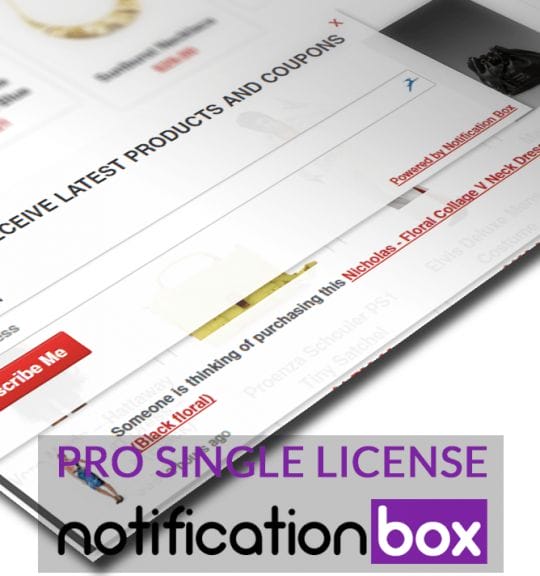
Single License – Notification Box Pro – WordPress Plugin
$39.00 Add to cart

Products
-
Notification Box Lifetime Deal Package
Original price was: $278.00.$160.00Current price is: $160.00.
-
Extension - Cookie Close Notification Box
$19.00
-
Extension - Notification Box Newsletter
$29.00
-
Agency License - Notification Box - WordPress Plugin
Original price was: $230.00.$150.00Current price is: $150.00.
-
Unlimited License - Notification Box Pro - WordPress Plugin
Original price was: $79.00.$60.00Current price is: $60.00.